100 years ago, there were only 4 countries in the world where you could expect to live past 50. Today, you can expect to live past 50 in every country in the world.
This blog is inspired by a wonderful book called Factfulness. Factfulness, by renowned statistician Hans Rosling with his son and daughter-in-law Ola and Anna, changed the way I perceived the world. It is the best book I have read in the past year. I very strongly encourage you to read it — this blog exists to encourage you to do so!
I really enjoy studying graphs, trends and data. After reading this book, I spent a good long while playing with interactive graphs, studying data sources and reading blogs. In this post, I share some of the ideas and realities that I’ve found most interesting, and visit just a few of the most important ideas in this incredible book. They’re truly “Ideas worth spreading”.
Us Vs. Them
Think about this for a minute. What percentage of the world’s population do you think live in low-income countries today?
Make a guess before you read on.

If you answered 56% or less, then your guess is closer than the average person!
But unless your answer was below 20%, you still weren’t really close.
I had a fish around to find out when in history your potential answer might have been correct. It’s interesting!
I guessed between 50% and 60%! …Your answer was right in the 1950s. I guessed between 30% and 50%! …Your answer was right in the 1960s & 70s. I guessed between 20% and 30%! …Your answer was right in the 1980s & 1990s. I guessed between 10% and 20%! …Impressive. But still wrong! Such is our progress that, today, only 9% of people live in low-income countries. If you guessed that — very well done indeed..!
9%, of course, is too many. It is shameful. But we must see this number with a clear head and with hope. The data points to hope.
The Chasm of Injustice
So, 9% of our neighbours live in poverty. Where are “the rest”?
It’s hard to identify the root of the habit of partitioning everyone into two distinct groups, divided in peoples’ minds by what Rosling calls a “huge chasm of injustice”.
There was a time where this mode of thinking was reasonably accurate. There was a time when, if you were to chart out various characteristics of human lifestyle on graphs, you could draw two neat boxes around all the points. “Us, the rich” and “them, the poor”. The West, and the “rest”.
But that time was around 40–70 years ago!
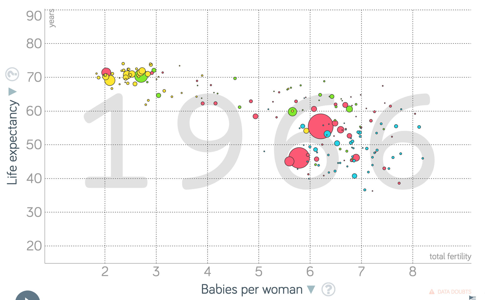
Decades ago, the distinction between richer and poorer was based on facts. These graphs show life expectancy vs. babies per women, where each bubble represents a country, and the size of each bubble represents the population. Yet the terminology and the mindset borne from the quantifiable differences that once existed has survived reality for decades. Today, there simply is no gap. In fact, there hasn’t been one for three decades.
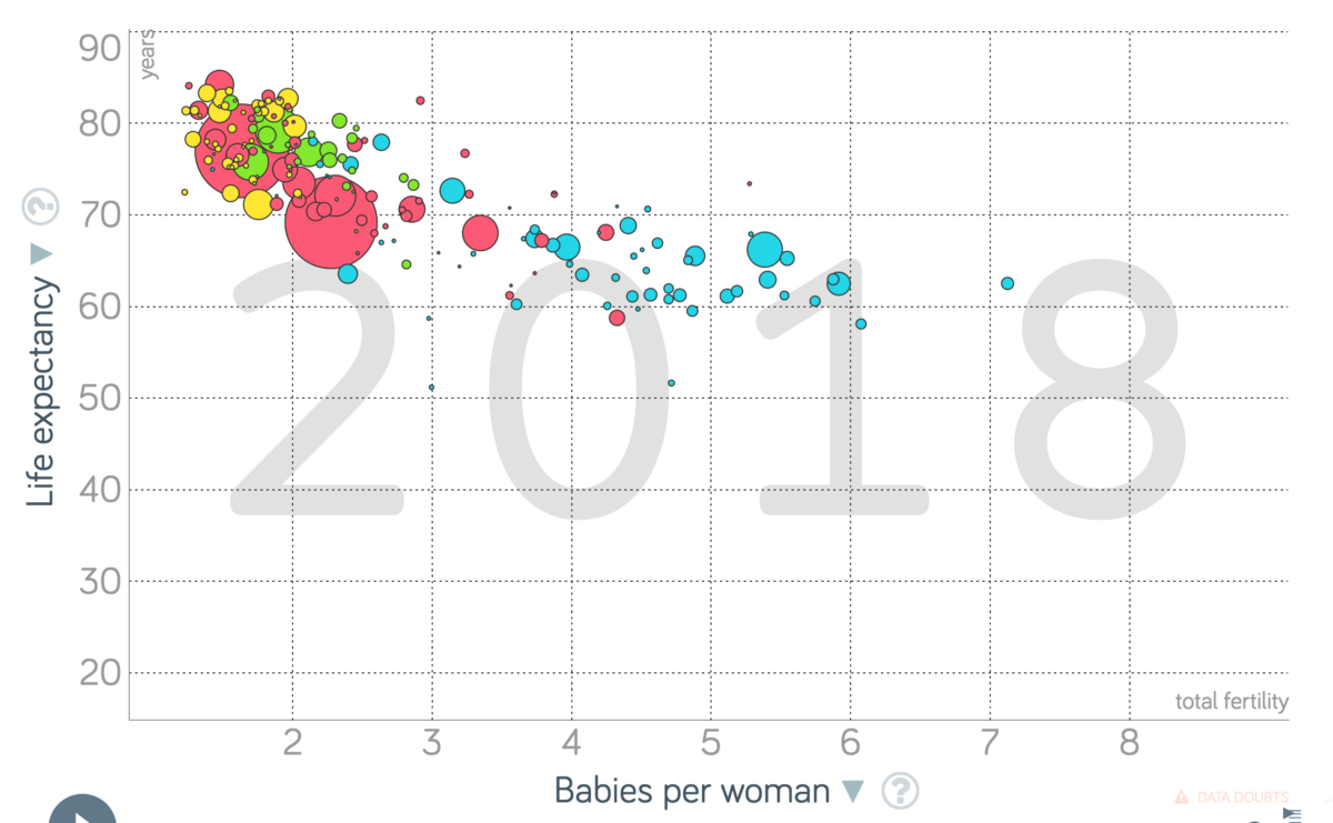
Drawing one would be arbitrary. Why not draw three gaps? Twenty? Today, people don’t live on one side or the other.
No Gap
The vast majority of people live somewhere in the middle. Here’s a couple of graphs. In the seventies we have two clear humps and a gap in between. In contrast, in 2015, the reality is very different.
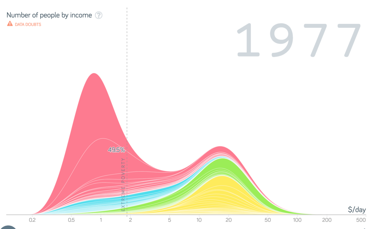
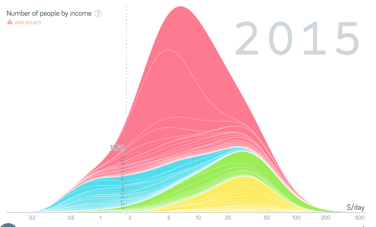
No gap. Simply the reality that most people exist somewhere in the middle.
Rosling’s instinct is that humans are predisposed to binary thinking. This intuition makes sense to me. It’s the most simple kind of distinction we know. Us or them. Yes or no. Good or bad. With or against. it makes for more dramatic stories, something journalists have — perhaps often unintentionally, or at least, not maliciously — exploited for centuries. The stories that opposites tell are the most dramatic and provocative. Which is, in turn, part of the reason we never hear about the middle 80%. The stories of those living in extreme poverty make extraordinary news for the rich news-consumer, and those of us that hope to do good in the world might give to causes which benefit the poorest. So charities convey their poverty to attract donation, support and man-power. All of this leads to…
The Negativity Instinct
Are crime rates rising or falling?
If you think it’s falling, you’re right. Here’s the data from the Office of National Statistics:
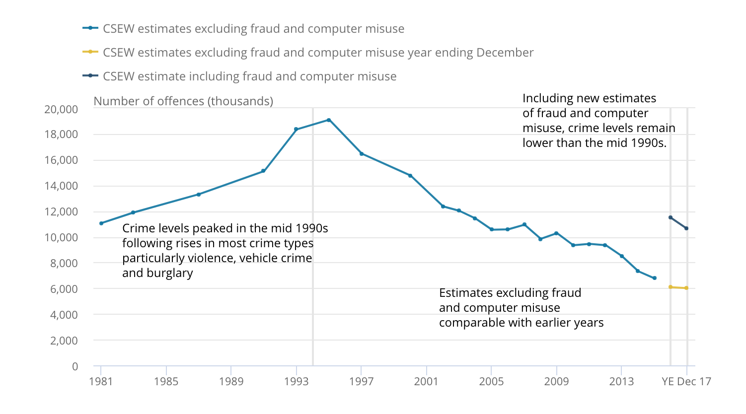
Yet we still have an instinct that crime is rising. We hear people say it all the time. More harvests are failing. Animal species are going extinct. Every politician is more conniving and corrupt than the last. The world is getting worse.
But the anomalies are the news. The norm isn’t worth reporting. But every time you hear about a violent crime, it’s likely you assume crime rates are rising.
Now, that doesn’t mean we should balance out the bad news with lots of good news. Something can be “better than before” and “bad” simultaneously, just like that 9% statistic I gave you before. But the media love bad news, and that causes us to believe lots of things that simply aren’t true, like…
“We’re going to run out of space!”
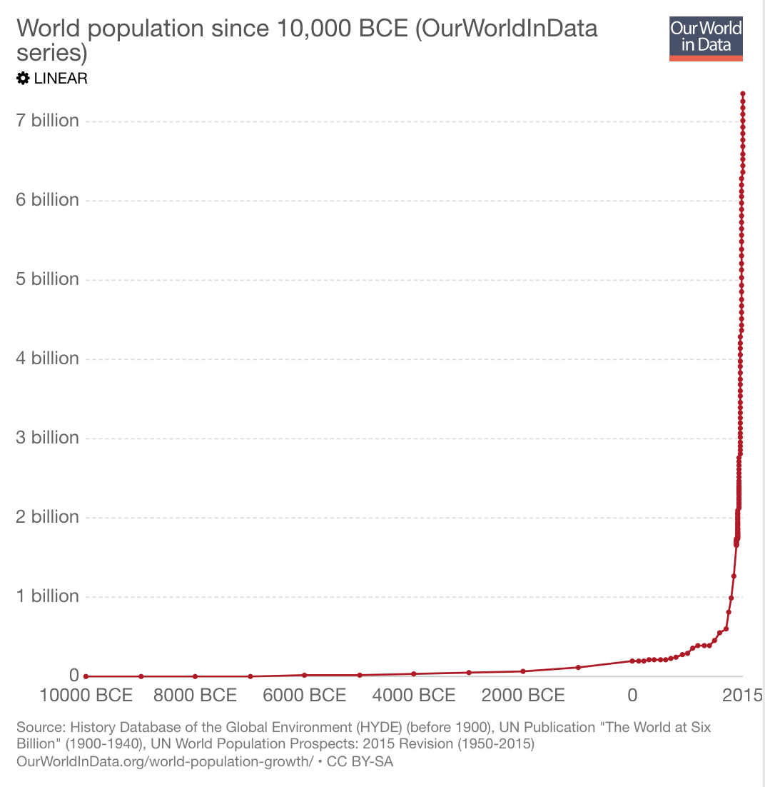
Here’s a graph I grabbed from some scaremongers on the net. The data shoots up almost at a right angle. Without any further information, I’d be justified in thinking that the growth of the world’s population was pretty terrifying. Look at that curve. It represents a seemingly exponential increase of the population, speeding up at an alarming rate.
We assume, faced with graphs like these, that the population will continue to multiply at this rate until there are simply not enough resources left to sustain us all. But that’s simply not the case.
Let me pose a question to you.
Given that the number of children in the world:
...was 1 billion 50 years ago
...is just shy of 2 billion today
how many children will there be in the world in 50 years from now?
If you thought it would be 4 billion, you shared my intuition. But no — in 50 years, the UN predicts that there will be 2 billion children. That’s right! We’ve pretty much reached what is termed “Peak Child”. So if that’s true, why will the world’s population continue to increase? Well, it’s because the number of adults is going to increase. And the main reason is not because more children will be born, rather, children that have already been born will get older.
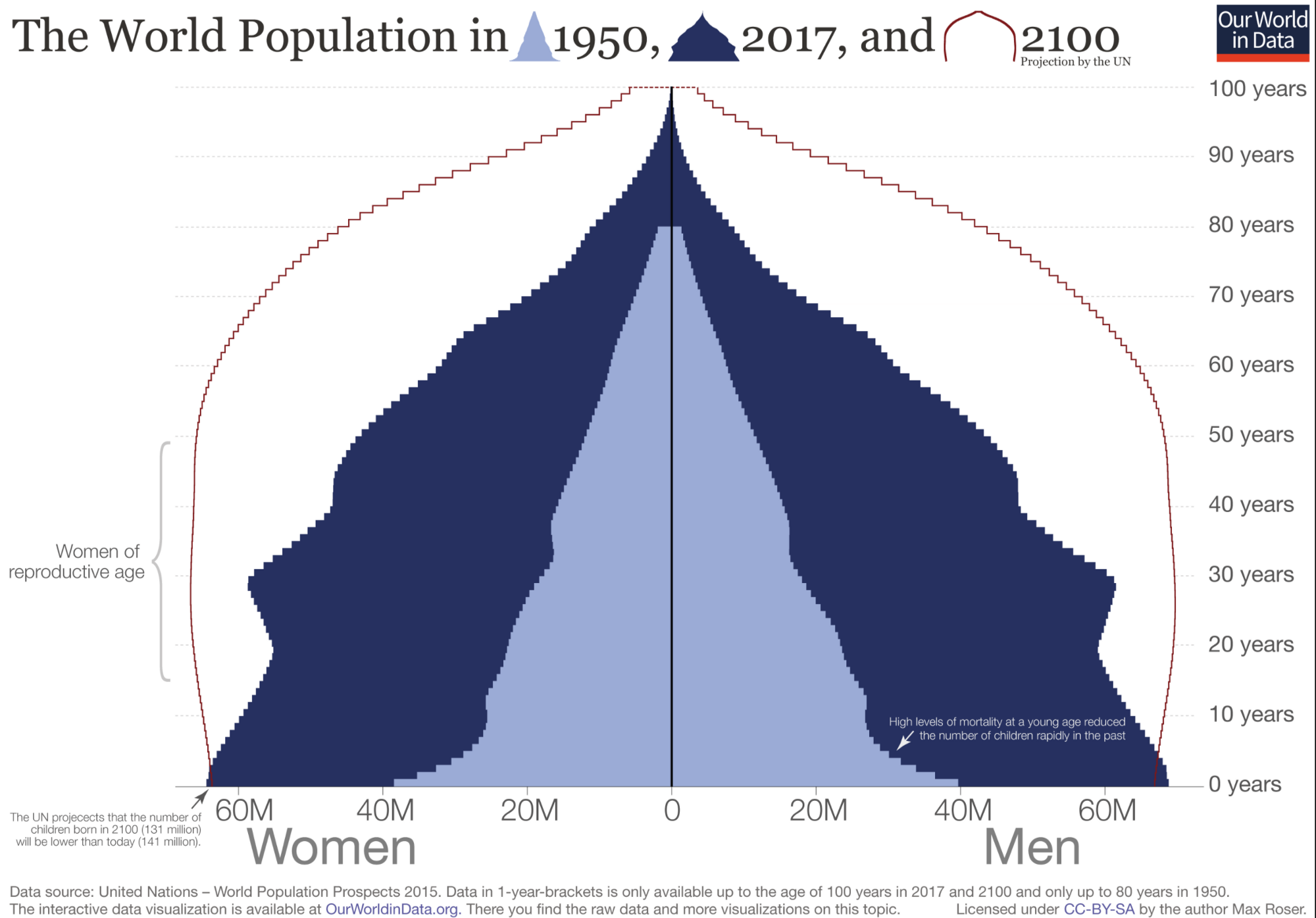
Yet that isn’t going to go up in a straight line either. The UN project that once we reach around 11 billion people, the growth will stagnate.
But why? Why won’t we carry on having yet more children? Well, that data is in the first set of graphs! There is a strong correlation between poverty and high babies per woman. As more and more people are pulled out of poverty, the number of babies per woman drops from 5–8 to 2–3. In 1965, the average number of babies per woman was 5. Now it’s just 2.5.
A balance will be reached, in some ways not unlike the balance that existed up until the 1900s. But with an important difference.
Before the 1900s, life was usually ‘nasty, brutish and short’. Each woman had, on average, 6 children, and 4 of them would die before having children of their own. In other words, 2 of those children have, in turn, 2 surviving children. This leads to a straight, horizontal line. The line is tragically defined and kept flat by the premature death of nearly 2/3 of everybody who was every born.
But when we reach 2100, there will be a new straight, horizontal line, defined not by death but by life. 2 parents will have 2 children, both of whom will usually live.
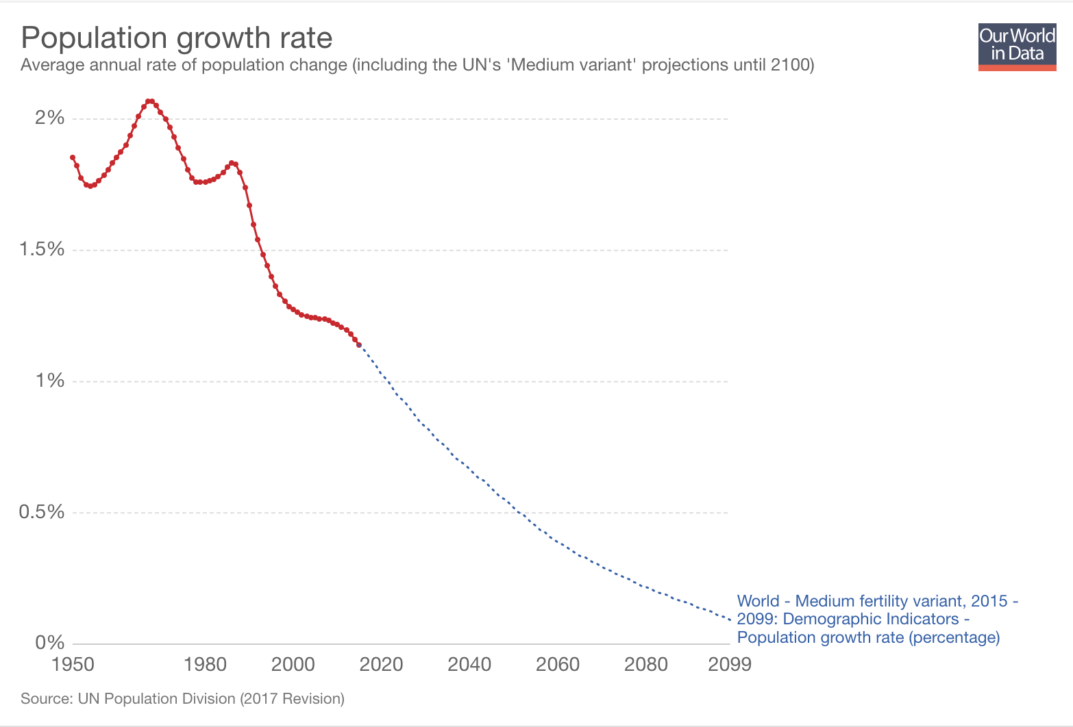
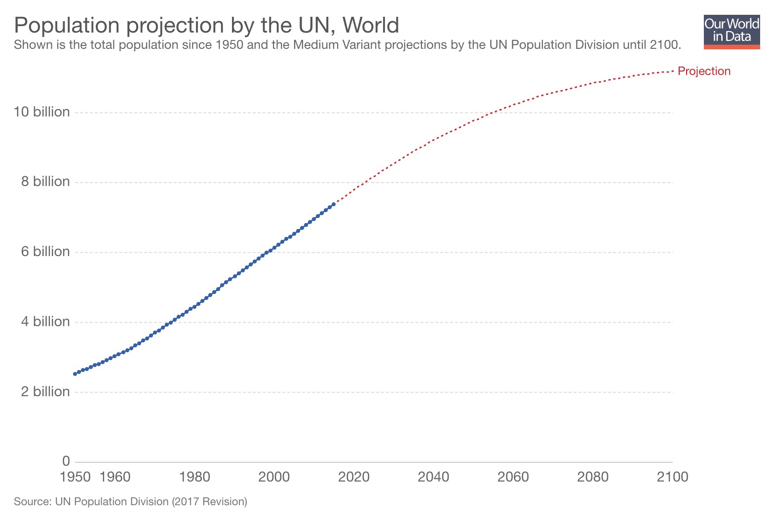
The UN predicts growth will slow until the population reaches between 10 and 12 billion people, whilst growth will drop to 0.1% in the next century Factfulness is all about the ways in which we systematically believe things which are simply false, and how our instincts distort the way we think about the world. Factfulness is defined as “the stress-reducing habit of only carrying opinions for which you have strong supporting facts”.
With that in mind, if you’ve enjoyed thinking about some of the ideas I’ve discussed, I’d strongly encourage you to look at some of the following:
Gapminder: you can have a play with the data yourself! Many of the graphs you see in this post are screenshots from an interactive app. You can play with them or build your own here.
Hans Rosling’s TED Talks: After he sadly passed away in 2017, TED published a playlist of his best talks in his memory, which you can find here. I highly recommend them.
Factfulness: If you feel so inclined and have around £10-£12 to spare, do read their wonderful book. It was worth every penny I paid.
Follow me on Twitter here to keep up with all my latest content!


